Music Meets Art Vol. 3
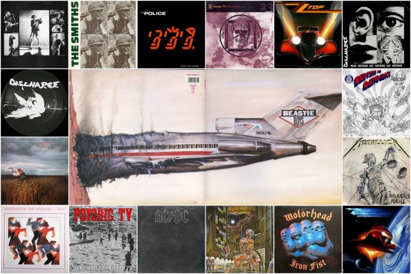
The development of album art got a frantic pace in the 1980s. The avalanche of records and arts for them was unstoppable. Each vinyl and cassette received some kind of exclusive drawing or photo. At that time science fiction was rather popular as well as the criticism of Western political regimes. All this was reflected in the works of musicians and artists. In the end, the "Evil Empire" was already exhausted, and it was clear to everyone that the country would reach its logical end. So that designers and artists started speculating with Soviet images with all might, especially since those images became available to the western people.
You will see 3 continents, 3 countries and a dozen performers who have left their mark on many scientific and popular works about album art for many years ahead in this review.
"Back in Black" became a landmark album for the 1980s. The Beatles had a "White Album", and AC/DC with its "Back in Black" started a whole era of "black albums". The release got its name because of the death of the band's vocalist Bon Scott.
This is the first release that the band recorded with Brian Johnson. It is produced completely in the black tone, there is only a selection of letters edging so that you can read what's on the cover. This design is related to the name of the album directly, as the musicians of AC/DC mourned the loss of their first vocalist.
Despite such design, "mourning album" was mixed and mastered at the sunny Bahamas, because in Great Britain the band did not fit into the schedule, and there were no available studios at that time. However, the island was covered by tropical storms, you can hear about it is in the chorus of the "Hells Bells".
AC/DC members were scared by the crab that burst into the studio during the recording, and the bells that sound on the album had to be recorded from the nearby church. The album became one of the best-selling in the world, as a result.
Now let's speak about INXS "Underneath the Colors", released in 1981. The design of the album, just like its name, was taken from the same lino engraving by Cyril Edward Power, an artist, architect, and teacher. He is famous for participating in the design of the English Main Post Office building and the home of King Edward VII.
"Underneath the Colors" depicts dancing couples or simply repeating dancing couple in a modern style. Images of a man and a woman are angular. Perhaps this is a reference to the cubism that appeared at the beginning of the 20th century. Power mentioned Picasso in his lectures many times.
The album became the second LP for INXS, but it achieved commercial success only years later. It was published overseas in 1984 after the band gained world fame.
Cyberpunk became an established style in the 1980s. People obviously expected some digital collapse, and it was only 20 years that left until the globalization of the information space. The art actively used all the attributes of digital themes in this background. The appearance of The Police "Ghost in the Machine" is one of the brightest evidence of these processes.
Sting took the name of the album from the book "Ghost in the Machine" by Arthur Koestler. In the Soviet Union, for some reason, it was translated as "Дух из машины" which means "Spirit from the machine." It is good that the Sumners' band wasn't renamed in the same logic.
The Police vocalist was found of philosophical and psychological currents that raised the problem of the formation of mind in the body and relied partly on the dualism of René Descartes in his young years. This had to affect his work and influenced the title of the album.
The design itself shows three seven-segment indicators, which in their upper part symbolically duplicate the hairstyles of the three members of the фтв. Sting is in the middle.
The "Evil Empire" finally was called so in the described period. Images of the Soviet Union were actively speculated and the iron wings were rising slowly. One example of this is the 1982 design by Depeche Mode.
The cover of the album "A Broken Frame" is a photo that looks like a picture from the era of socialist realism. It depicts a woman who mows grain in the field of eastern England, not far from Duxford in Cambridgeshire.
The work was done by photographer Brian Griffin. He has already worked with DM before that taking pictures for "Speak & Spell". The photo is so similar to the picture because the author used a mix of natural and artificial lighting.
Griffin was inspired by Ukrainian art, especially the works of Kazimir Malevich in this photo. And then he was fascinated by German romanticism. This picture becomes the cover of the 1990s issue of Life magazine, which publishes the best pictures of the 1980s decade.
Depeche Mode will later use the symbols of the USSR in their works more than once. One of the most striking are the cars crushed with sledgehammers by Gaham & Co. in the clip for the song "Stripped".
It is difficult to say by the music, whether Foggy Albion was the leading country maximally producing a high-quality musical production the 1980s. But you can't deny the fact that the most underground, crazy and experimental things were born there, in the decade of Margaret Thatcher.
Aggression and protest usually stand close to everything unusual and strange. In the case of the two following British heroes, it happened the same way. We decided not to divide hardcore-punk Discharge "Hear Nothing See Nothing Say Nothing" and post-punk (we don't want to use the word "indie" with this and) The Smiths "Meat Is Murder". The design is very rigid and brings a specific message to the masses in both cases.
The first album art was created by the vocalist of the band Kelvin "Cal" Morris. The meaning of the work itself was anti-apathy, as specified in the description "heads of those who hear nothing, see nothing, say nothing will turn into cabbage." All four pretty sharp images on the cover lead to the photomontage of a 1930s German artist John Heartfield.
By the way, Discharge also used his famous 1932 pigeon of the peace, pinned on a fascist bayonet, for another release. This reference is not accidental: before the Second World War adherent movement "Dada" demeaned popular music, considering it a bourgeois whim.
In general, hardcore players performed the same thing, projected on their time. They regarded a noise component as a tool in the fight against the global status quo and an opposite to popular music.
Discharge gave a powerful impetus and influenced the modern punk-hardcore scene in an ideological, musical and visual sense. D-beat, Scandi-crust, Japanese Hardcore, US crust — all respect that pioneers.
Besides Discharge was one of the pioneers in the punk environment, where the creation of a cover using a collage of newspaper clippings is not considered as something shameful. On the contrary, it lets the music fan know what ideological message he can expect from this release.
Things were about the same with The Smiths. Steven Patrick Morrissey is, in fact, quite a brawler, despite romantic tone in his voice and the harmony of sighs in the songs. For instance, the lyrical vocalist once devoted a lifetime epitaph to Margaret Thatcher mentioned above.
The scandalous tricks of The Smiths leader are known to our days. But one of the most famous is the album "Meat Is Murder". Everything is important in this release, starting from the name and propaganda of vegetarianism ending with the cover itself. The Smiths used a frame from the 1968 film "In the Year of the Pig", directed by Emile de Antonio, talking about the Vietnam War. (In 1969 it was nominated for the Oscar as "Best Documentary"). The design depicts a soldier of that time in a helmet with the inscription "Make War Not Love" — an altered hippy slogan. That inscription was changed to the title of the album on records sold outside the United States and Great Britain.
While we were describing a British conglomerate with its colony for convicts, on the other side of the Atlantic, in the freest country, continued the same album art revolutions.
Fiction had always been popular in the twentieth century, but in the 1980s there was a great interest to its scientific component. A lot of stylizations, including retro style, appeared under its influence in that era. ZZ Top with their two releases "Eliminator" and "Afterburner" distinguished right then in the US.
It's now impossible to imagine one album without other. Both of them are decorated in the equally vivid manner, typical for that time. While the first cover represents just a retro style, the second one is futurism A classic 1933 Ford coupe was used for the album art "Eliminator". By the way, they share the same name. This car belonged to the frontman of the band Billy Gibbons. He tuned it often, and ZZ Top repeatedly used it in their clips. The term "Eliminator" has a lot of meanings itself, one of which means "winner of drag racing" in American slang.
The logical continuation of the 1983 album was released 2 years after "Afterburner". The main requirement for the design from ZZ Top was the same Ford. It must have been on the cover. This time, the album art was done by the artist Barry Jackson, who is known for his works on the cartoons "The Nightmare Before Christmas" and "Shrek."
As a result, the hot rod looks like very futuristic, and this is not surprising since "Afterburner" means the hottest part of the flame that comes out of the nozzle and burns to full acceleration. Space landscapes including the retro "Eliminator" are shown well in the band's clip for the song "Rough Boy".
Despite all the theories, punk, as well as hardcore, was born in America, and not in GB. In 1986 Dead Kennedys decreased their musical activity and released their fourth and last LP "Bedtime for Democracy".
The name of the release is an allusion to the movie "Bedtime for Bonzo", which casted the President of the United States Ronald Reagan. Jello Biafra decided to tease the head of the country at that time. So there is a sharp criticism of the reagonomy and democratic institutions in general in the release.
The design of the album clearly shows the vices and misconceptions of the American society of the time. Criticism of the regime in the manner of Dead Kennedys is a helicopter with an injection of a lie in the hand of the Statue of Liberty, a money note bearing the inscription "We are the people" sticking out of her nose, NASA shuttle crashing into America's eye, military, white collars, swastikas and much more. It all can be found in the release design. And if you study it in detail under a magnifying glass, you can see even more!
Speaking of the 1980s, it would be a blasphemy not to mention industrial. One can still see the consequences of that music genre in the modern audience. And the picture created by representatives of that movement is quite a Psychic Television. So let's talk about it.
In 1984 (a landmark year, isn't it?) Genesis P-Orridge and his Psychic TV band released a classic album "Those Who Do Not". Many of you probably saw a skull, which has a band logo cut out on its forehead, reminding some occult symbol. At the backdrop of the crane, there is a stylized square, the letter "E" on the left, and the number "23" on the right.
The release has two cover versions in general. The second one, which became a classic, is a black and white photo that shows a small crowd of people coming down, apparently, from the mountain, with the ritually mystical white figure. The album came in two designs — black and red, limited edition of 5,000 copies each.
While recording "Those Who Do Not" in Iceland, the musicians used the unique Piorrijmeter instrument. In fact, it was just an ordinary sampler changed to the needs of Psychic TV.
No less blasphemy, in our opinion, would be not to mention the existence of Iron Maiden and their mascot Eddie. We will make separate material about this phenomenon in music, but we can't leave 1986 "Somewhere in Time" without attention in this article.
A big mass of facts, associated with the 10-year history of the band, is encrypted in the cover of this album so that one can even write a separate note about it. We will list some of them, and you can read the whole list yourself on Wikipedia.
- There is a nightclub Sand Dune in the design. The band's song "To Tame A Land" is based on the books about the planet Dune. And it must be said that back then there was a great hype around the epic of Frank Herbert. No surprise, as science fiction was on the peak of popularity.
- Another fact devoted to science fiction: in the lower left corner there is a movie theater named after Philip Dick. And the "Runner on the blade" in the form of the inscription "Live After Death / Blade Runner" is announced above it at the entrance.
- Tardis from "Doctor Who?" landed over the "Rainbow" club and there is Batman opposite to her under the Tehe's bar. As if something is about to happen. However, there has never been such a movie or comic book, where the Time Lord would clash with the Man-Bat.
- There are two inscriptions in Russian: "Kefir" and "I vomit" (the relationship is obvious) and in Hebrew: "Gene" and "The Name of God", which cannot be pronounced.
This album art was painted by the notorious Derek Riggs. This time Eddie turned into a character from the future and began to look like something between the combat android and the terminator. A necessary tribute to those times.
But fantasy was not the only trend. There was more than enough fun in the music, and there were also many experiments "on the edge", since this was an era of musical discoveries.
Without humor and combination of styles, there would not be "Licensed to Ill" by Beastie Boys. Until now, its real name "Don't Be a Faggot" causes a smile.
Of course, the issuing label Def Jam Recordings asked to change the name of the release to the more neutral one. Of course, the white hip-hop trio did it. Surprisingly, at the same time, the company agreed to release a cover with a spread. In full view, it shows a crashing plane, similar to a stubbed cigarette. Interesting facts in the design: pay attention to the tail of the aircraft, the numbers on it are read as "Eat Me" in the mirror reflection. The author of all this visual joke is David Gambale, better known as World B. Omes.
And something funny — Kerry King, guitarist of Slayer, was in the same studio with Beastie Boys at the same time and took part in the album. In addition, rappers mixed Led Zeppelin and Black Sabbath in the track "Rhymin 'and Stealin'" — they took drums samples from one and guitar samples from another.
The next heroes were not cut on the samples at that time since the metalheads were severe back then and could hit one with a fist. And as far as skin jackets, "bolts" on the fingers and all the equipment was not removed even in the shower sometimes, we can imagine the level of severity, for example, of the Motörhead admirer.
That, in fact, can be seen from the album cover, where there is a clenched fist with bolts in the form of skulls. Severity and straightness are obvious. This release could not be ignored, but in fact, almost every Motörhead album is something like a cult. And all their releases represent some era in the musical subculture. The band did not change their line for all the time and it does them an honor.
The band became a cult once more after 2015 (Lemmy Kilmister died on December 28, 2015 - ed.) and it turned out that Motörhead had two or even three times more fans than it seemed. And if you judge by the popularity of prints on clothes, they can only be compared with the Ramones...
Since we tried to balance the two hemispheres, the two countries, the Old and New Worlds in this article, in opposition to Motörhead we must remember Metallica with its loud and uncompromising music and "... And Justice for All" album. Like the first heroes of our article, Metallica debuted with Jason Newsted in this album. He replaced bassist Cliff Burton after his tragical death in 1986. So that the events at the time of the release were not optimistic.
In the 1980s America the political and social structure of society was severely criticized by representatives of the heavy scene (see Dead Kennedys above - ed.). This all was caused by the arms race, nuclear and space programs, the triumph of the consumer society, the level of crime etc. Therefore, it is not surprising that Metallica decided to use political motives in the design of their fourth LP.
The album art itself was painted by Stephen Gorman based on the sketches of Lars Ulrich and James Hetfield. The cover depicts Themis, who is being pushed from the pedestal. On her scales there are dollars, and her breast is bare. Musicians specially displayed the name of the album in the graffiti form. The phrase "... And Justice for All" is part of the oath of the US flag.
The album sharply displays military themes. In particular, this concerns the song "One". Its story is directly related to the book "Johnny Got His Gun" by Dalton Trumbo. Later it was filmed, and the song, video, and concept itself were studied in smaller works and, perhaps, even dissertations.
The material was prepared by Philip Dobrov, Valery and Julia Kornevy, Olexander Masovets, Yaryna Denysyuk. A huge thanks to them!
To be continued… in 1990's
All the parts of the material are here:
https://www.neformat.com.ua/rubrika/music-meets-art
All images are copyrighted by their respective copyright owners.

